Case Studies > Banca Widiba

Banca Widiba is an Italian online bank, part of the MPS Group, that operates without physical branches for standard transactions such as deposits, money transfers, loans, and mortgages. Its Financial Advisors maintain personal offices to meet with their clients.
Indeed, its purpose is to acquire young customers and guide them through their financial investment journey. As a purely online banking service, a robust mobile application is essential to enable customers to manage their finances efficiently and seamlessly.
About Banca Widiba
Below is a list of keywords selected following data gathered after a huge User Research made by a platform we called “Say&Play”. Basically an offline and online Survey, available for anyone who reached the web page or took part, as an attendee, at the events began some months before the first release. So at the end we knew something about primary functions, but we didn’t know what was and wasn’t the customers preferencies.
Keywords
Daily
Operate
Investments
Manage
Promotions
Smooth
Financial Advisor


Easy
Fast
In its first three years, Banca Widiba had a different brand image. As a UI Designer, my role was to create components in collaboration with other designers. I worked closely with front-end and back-end developers to identify the most feasible solutions for implementation, ensuring a consistent visual experience with the desktop private area.
My role as UI Designer
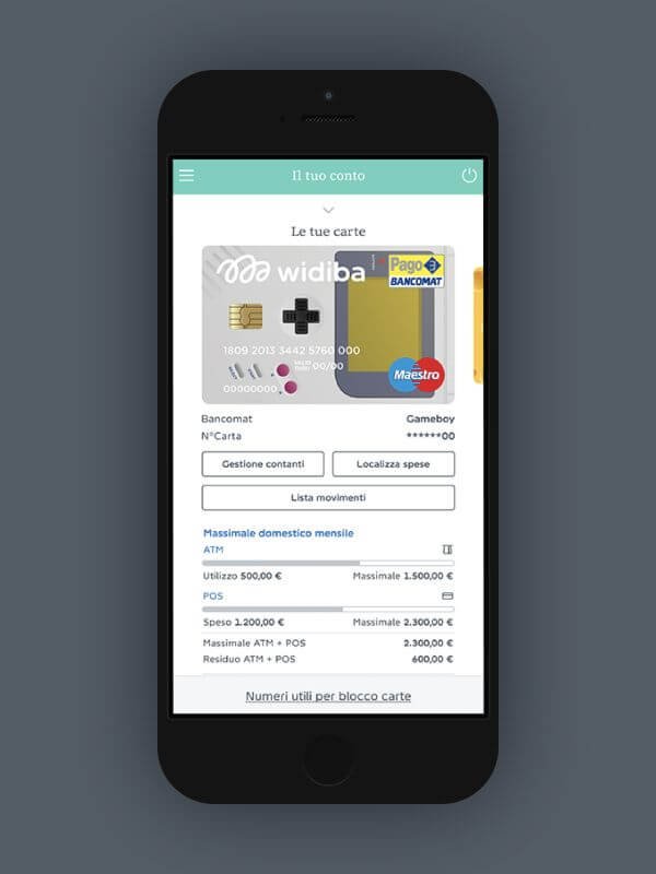
While working on the mobile app, the need arose to design an application for daily use, which also served as a gateway to the other functionalities available on the website.
The challenge

First release (2014)

In 2018, Banca Widiba initiated a rebranding to reposition itself in the market while maintaining its core values. This was a purely visual rebranding, encompassing:
A new logo
New imagery
A redesigned website
New physical products, including debit, credit, and prepaid cards, and packaging.
The rebranding was essential because many people did not recognize “Widiba” as a bank. Although the logo included the tagline “No ordinary bank,” it was lengthy, had a small and difficult-to-read font.
Therefore, understanding our customers and prospects was crucial for our corporate improvement. This was a challenging process, and it coincided with my transition to a UI Team Leader.
New role, new challenges.
Re-branding 2018

I collaborated closely with five designers to redesign all touchpoints in accordance with the new brand identity guidelines. We initially brainstormed new UI component concepts for the website redesign. Following several meetings with various proposals, the IT department selected the optimal solution for implementation.
My role as UI Team Leader.


With increased budget, time, testing, and feedback, we were able to refine our approach. Before releasing the major update, we conducted user testing with the assistance of TSW.
TSW proved to be invaluable, offering expertise in SEO, user testing, and user research..
During this period, I became increasingly fascinated by UX practices.
And what about the mobile app?
Second release (2018)


This video presents the app to the public.
A role change from UI…

…to UX

During the COVID-19 pandemic, I dedicated myself to acquiring new knowledge and honing existing skills, including completing a three-year massage therapy course. This combination of events and experiences shifted my focus towards understanding people's needs and feelings. I began to ask myself: What are their necessities? How can I help them overcome obstacles? How can I make their lives easier?
Spending more time talking with people and actively listening to them became, and continues to be, essential to my growth as a designer. This period also provided an opportunity to combine my past experiences as a UI designer with new skills and perspectives. Consequently, I decided to step down from my role as UI Manager and return to a UX-focused role under the guidance of the UX Manager, whom I hold in high regard.
Why this choice
Banca Widiba use internal software to monitor users and gather data for analysis. This role change coincided with accessibility becoming a legal requirement, for public institutions and financial services too. This legislative mandate aligned perfectly with my personal values, as I am passionate about advocating for people with disabilities. I believe that many online and offline services discriminate against a portion of the population, which is unacceptable in my opinion.
Our tool proved invaluable, as it combined user behaviors, ratings, comments, and all the essential UX KPIs. My responsibilities included:
Analyzing user data.
Interpreting findings.
Identifying potential solutions.
Prototyping solutions with the UI team.
Conducting user testing through in-office and remote sessions.
Overseeing the development process.
Iterating based on feedback.
This work was highly engaging and fulfilling, especially because it required me to consider both public and private services and focus on the holistic customer experience.
My role as a UX Designer (2021)
Packaging
Public website
Desktop private area
Mobile private area
Mobile app
Financial Advisor platfrom


Because of privacy and copyright I can’t use images relatives to projects and activities in this Case Study.
To know and see more, visit the website www.widiba.it
Next case study
Digital Democracy
